KC 3.0
KC design office 3.0
-
 LocationTaipei, Taiwan
 -
 Area50P
 -
 Project YearOffice
 -
 Project LeaderKuan Huan,Liu / Chun Ta,Tsao/Hsung Yu, Sung
 -
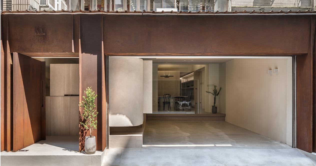
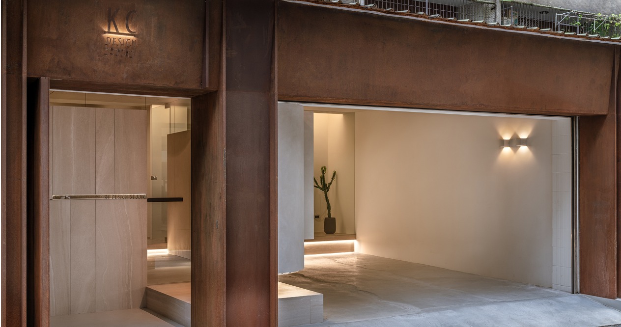
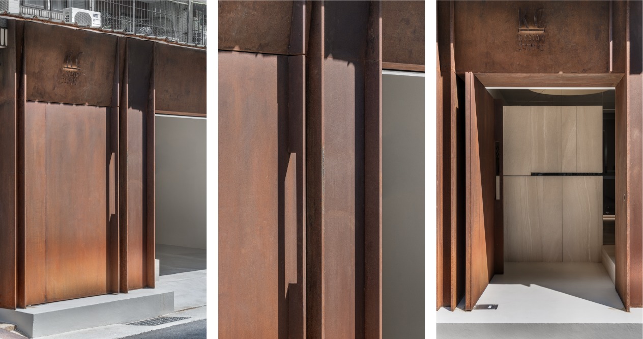
 Building materials設計以簡約俐落為視覺體驗,外觀選用耐候鋼,機能上的開口加上垂直線條的分割,陽光和雨水反應在鏽蝕面感上,看似簡單卻多層次交織,賦予大門不同的面貌。
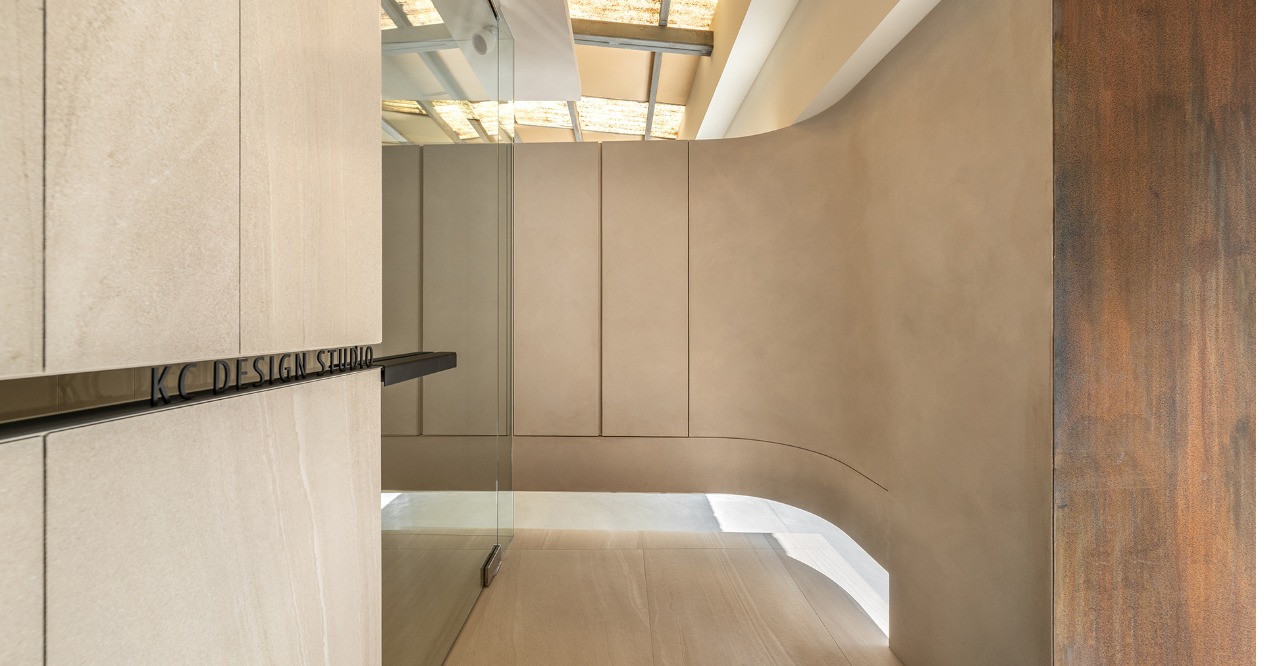
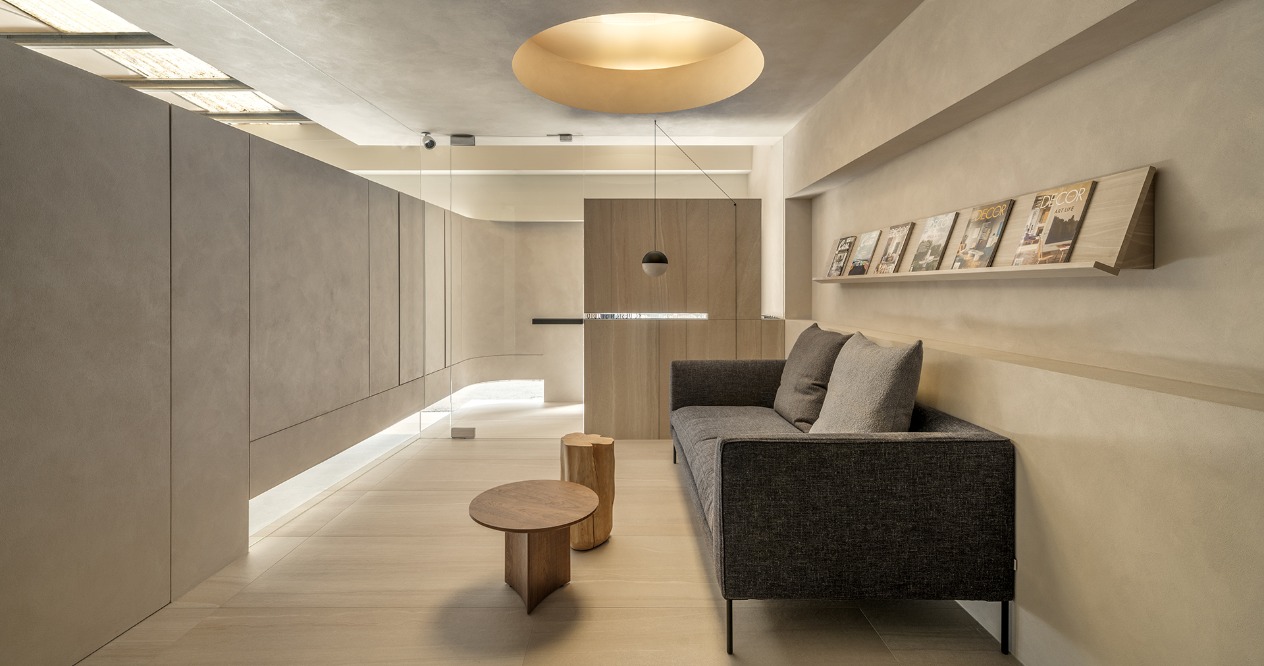
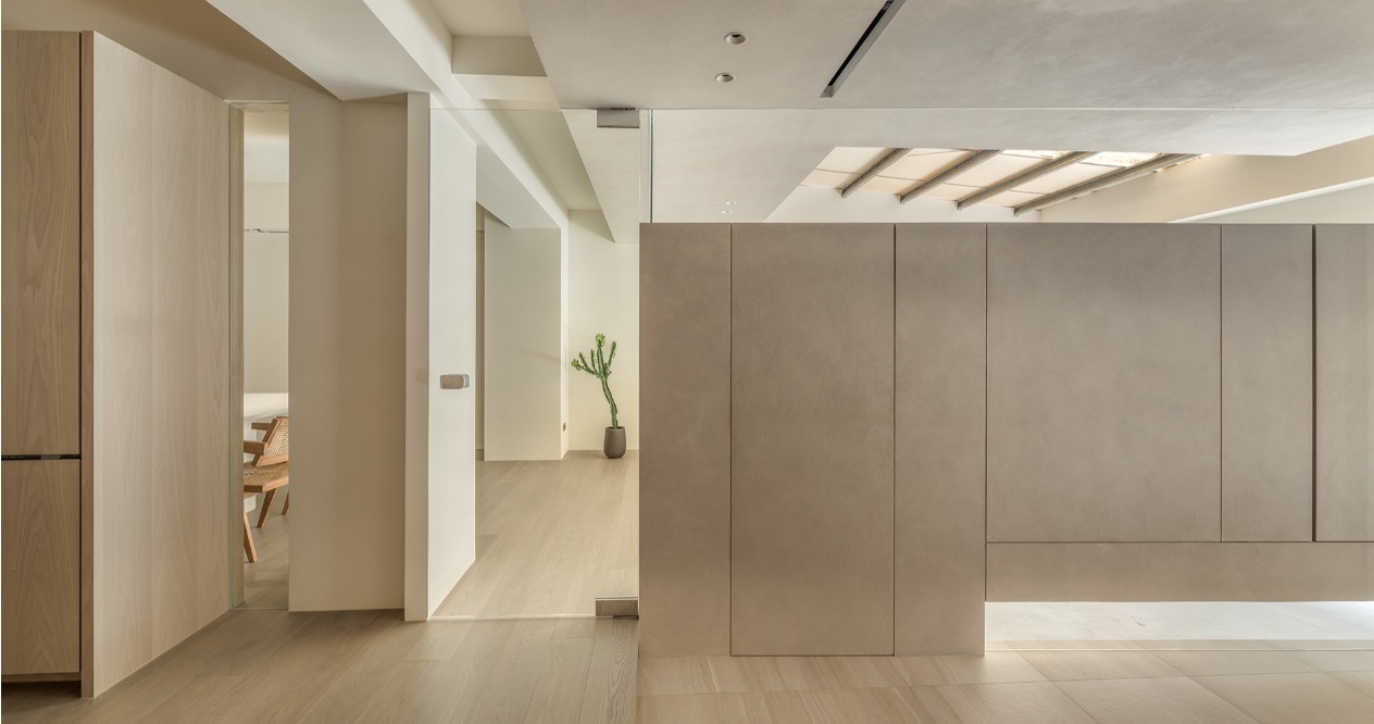
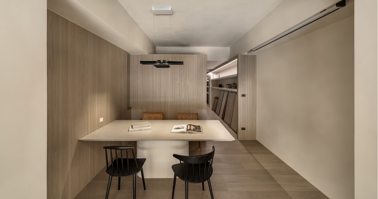
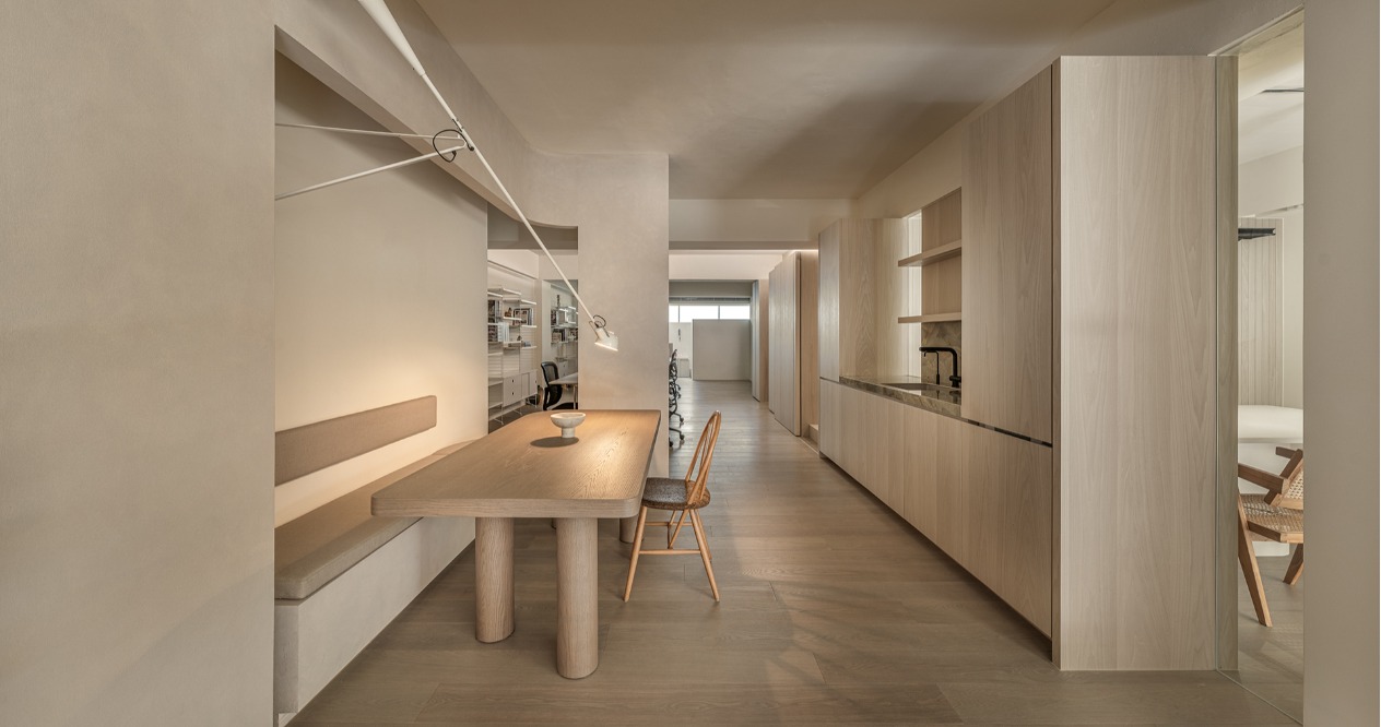
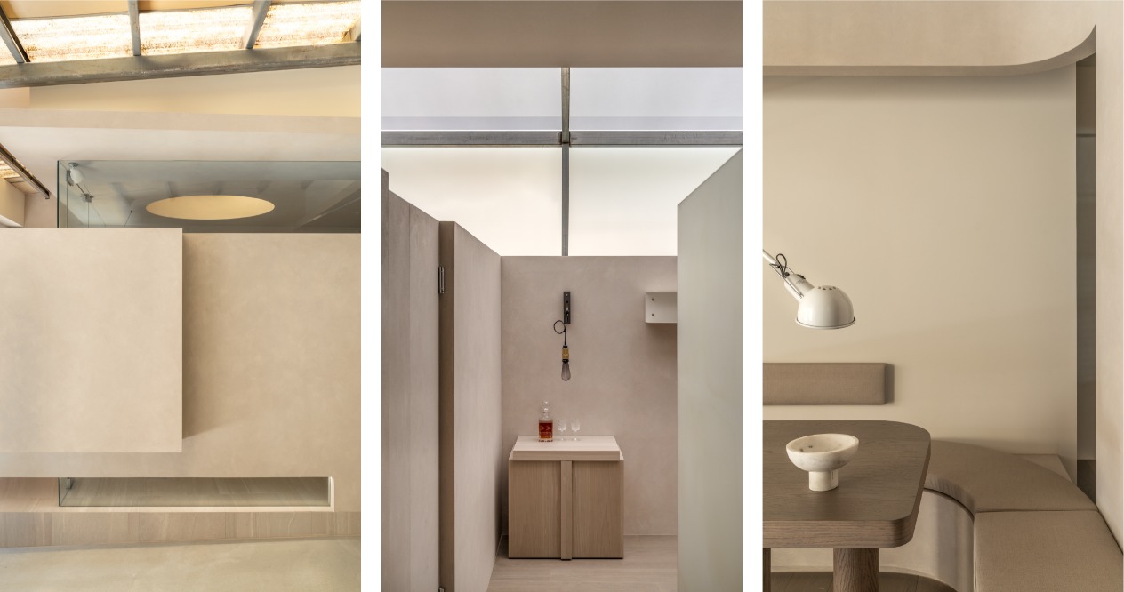
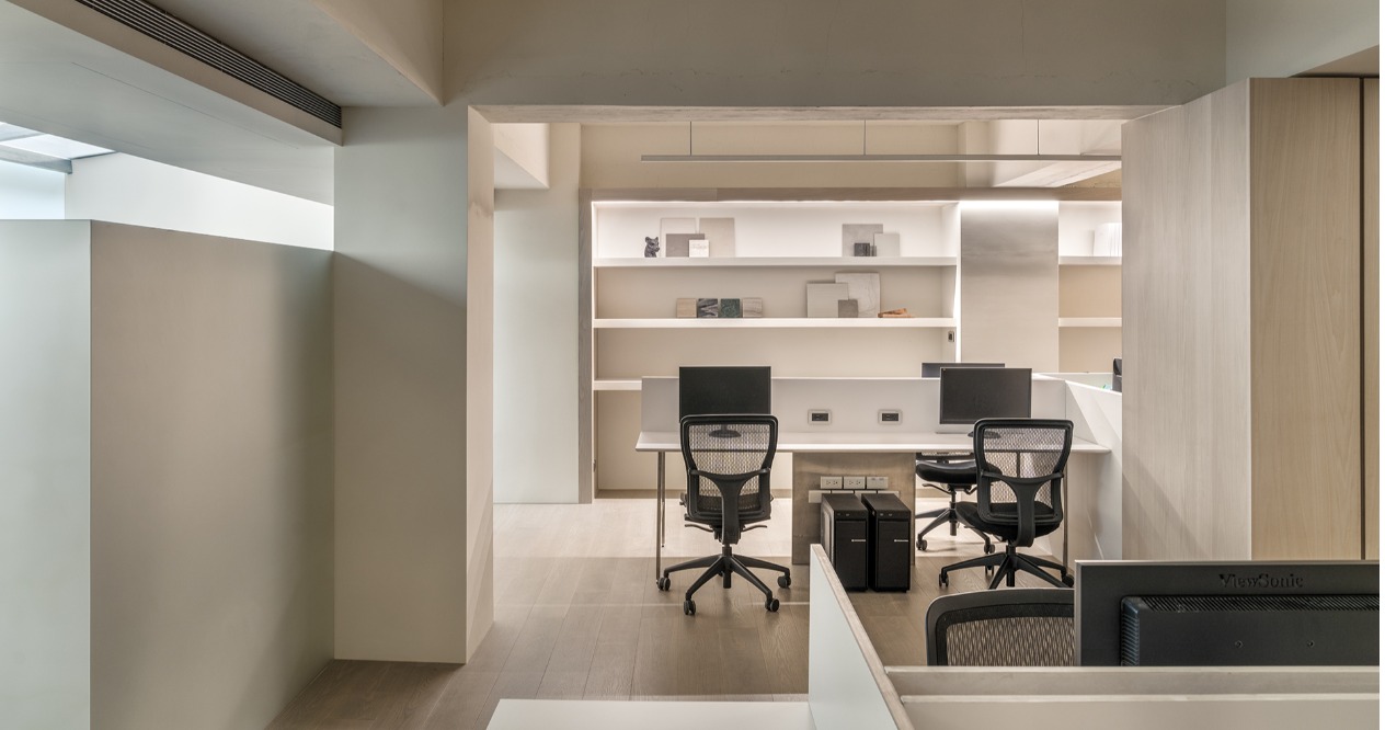
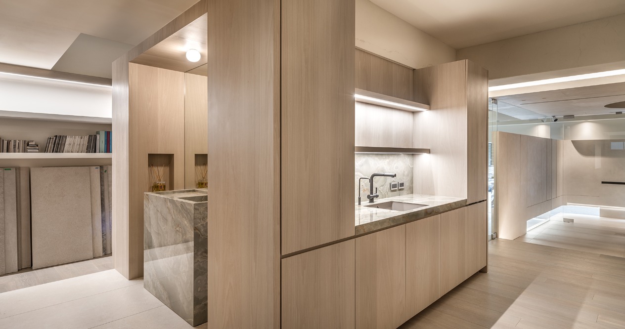
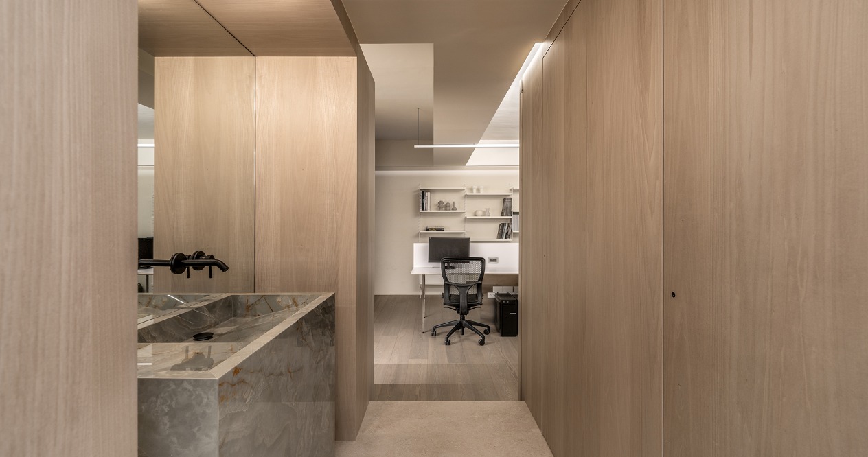
室內格局依採光順向配置,必免光線受到阻隔。規劃成前後兩個場域,前半段主要規劃會議室與多功能區,進門處到接待區以柔和的弧形引導動線,天井開口、廊道懸挑的形式減少量體的厚重感藉此引光入室,改善較昏暗的空間。利用茶水區作為空間中的隔屏,後方則作為辦公區,讓各空間再開方式格局中也能不受干擾。
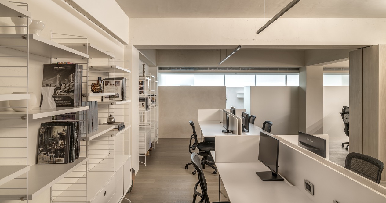
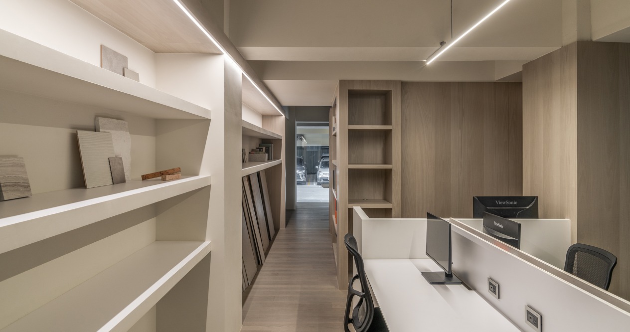
考量原先架高地勢與較低的天花,擔心室內造成壓迫,選擇不包覆天花板,將所有配線隱藏至樑柱櫃體中,整體以溫潤的色調為基調,舒緩壓迫感,在區而不隔的設計中賦予自由無拘的寬闊感受。
The visual experience of the design focuses on simplicity and neatness. The exterior made of weathering steel has the functional openings and divisions of vertical lines. As the sun and rain are reflected on the rusty surface, the simple but multiple intertwined layers endow the gate with a different look.
The interior layout is arranged according to natural lighting to avoid light from being blocked. The space is separated into the front and the back areas. The front area is mainly the conference room and multi-purpose area. A gentle arc leads the flow from the entrance to the reception area. The opening of the courtyard and the overhanging corridor reduce the heaviness of the volume. Light is therefore introduced indoors to brighten the dark space. The office area is behind the pantry room, which is used as the partition of the space. In this way, each area will not interfere with each other in the open space.
Considering the original elevated floor and lower ceiling that may cause the oppressive feeling, we choose not to cover the ceiling but to hide all the wiring in the beams, pillars, and cabinets. The overall warm colors will relieve the oppressive feeling and give a sense of freedom and spaciousness.to the space without fixed partitions.


